ShopDreamUp AI ArtDreamUp
Deviation Actions


Suggested Deviants


Suggested Collections


You Might Like…


Comments9
Join the community to add your comment. Already a deviant? Log In
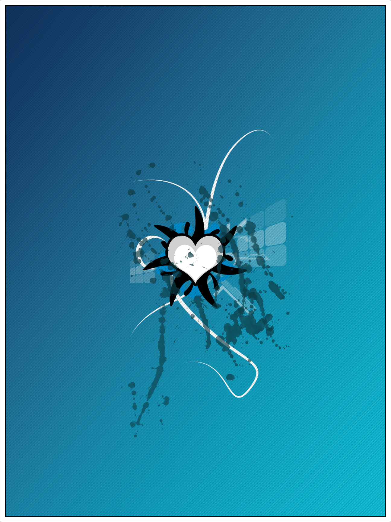
This is a vector art, which to me is synonymous to communication design. These are art types that often constitute a very visceral level to attract people to the message that is trying to be said. So when I see images like this, my eye is immediately drawn to the purpose. Among all of your vector art, which is very skillfully handled, I am drawn into the design, but it all seems a little superficial. All there are are layers upon layers of beautiful patterns and random abstract images that really amount to nothing more than a pretty picture.
You should try and incorporate typography or text into pieces more, a simple word being abstracted and adjusted can be a very powerful abstract tool for a vector artist. Without it, vector art seems lonely or empty.
Vector art is the industrial art of 2D, it has a very specific purpose. These are logos or magazine shots or ads. Something you expect to see realized corporately. Designs should of course fit a certain theme, and this piece really seems to have one. It is very sleek, with a mix of grunge-splatter, which I find amusing. Of course Splatter effects are easy to beat to death as they are so common recently.
In this one the main theme appears to be the heart, you chose to do a centered alignment, risky... but it works very well here. Surrounding the heart are black triangular splatter marks radiating from the center. These black lines are probably my least favorite, when zoomed into full scale view, they become the only part of this abstract piece that one can clearly associate with the pen tool.
I would go back and make the curves smoother for the black splatter. Otherwise, the rest of the image is pretty stupendous. I enjoy the white grass-like-curves. I enjoy the rounded cubes and the interesting tilt their axis is on.
The only other problem I have with the piece is that the layers are a little too obvious, you might want to try and mask obvious differences in layers for future projects. As an artist, one of the best skills you an possess is the ability to hide your tricks. Screw around with us, the more complex you make the simple things, the more substance it will have over time.
The monotone is also very strong here, you are very good with colors as it all flows together very nicely. You are very skilled when it comes to this kind of art, I look forward to seeing how you adapt this skill into a more marketable environment.
I hope the review was helpful, thanks for the great piece!